There are two graphs in the Graph section of the Aware Local Test Analytics tool. These are meant to facilitate conversations about the assessment in conjunction with the metrics at the top of the tool.
Learning Standards Bubble Graph and Chart

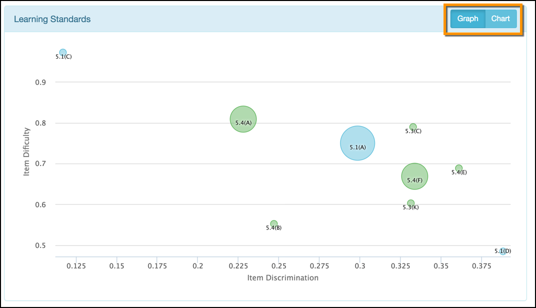
This graph and associated data chart plots each tested learning standard on a plane representing Item Difficulty vs Item Discrimination. The size of each learning standard’s bubble is related to how many assessed items were tied to that standard. A larger bubble represents more tested items for a standard than a smaller bubble.
Item Difficulty (p-value) - the proportion of correct answers; values between 0 and 1 (see Item Statistics section for more information)
Item Discrimination (rpbi) - represents the relationship between performance on a single item and performance on the entire assessment; values between -1 and 1 (see Item Statistics section for more information)
Raw Score/Percent Score Distribution Graph (Histogram)

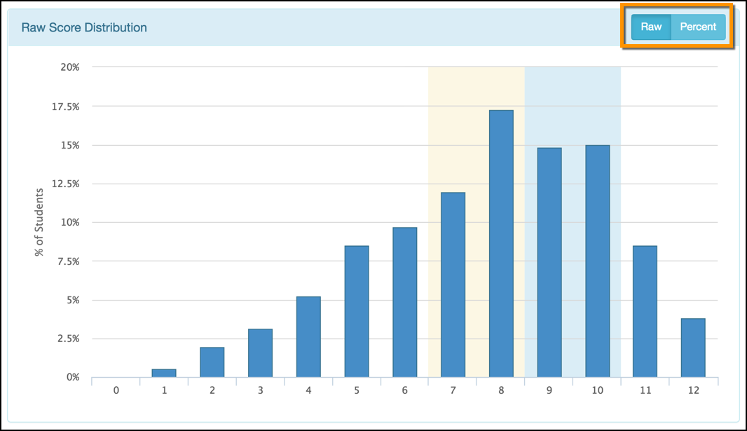
This is a very useful graph for test authors to use in conversations about overall test performance. It plots all of the test scores for every student to show the distribution shape.
The most likely shape of this histogram is bell-shaped. Because local assessments in Aware are almost all criterion-referenced tests, a normal bell curve will likely not occur in this graph. A criterion-referenced test is administered with the intent of mastery learning. The ideal “bell” shape for such a test would be pushed towards the right side of this graph with a peak near the end and a small “tail” for the highest scores.
The less uniform this graph is shaped, the more likely it is that some of the items needed to be more accurate in measuring what they were intended to measure, resulting in some students missing them due to factors other than learning deficits.