Aware allows users to color-code their data views and arrange the table vertically or horizontally. These options allow for greater readability of the data based on user preferences. Any option the user employs will also display the same way when selecting Export to PDF.
Coloring
Color-code test data to make patterns stand out, allowing you to examine trends in student testing, mastery, growth, and more. Click the Color Results icon to apply color coding.
The data is color coded according to the following percent score scale:
90% - 100%: Green
80% - 89%: Yellow
75% - 79%: Orange
≤ 74%: Red
Select the Don’t Color Results icon to return the data table to black-and-white viewing.
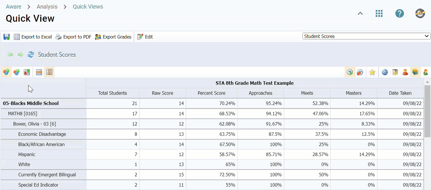
Orientation
You can change the data view orientation to display results horizontally or vertically. Compare Across Tests is the horizontal option for data, while Compare Across Groups is the vertical option. If you have applied color coding, it will appear in both orientation views.
Some data views are better suited to one orientation than the other and may be more printer-friendly in PDF format, such as the default data view for the Student Learning Standard Breakdown.
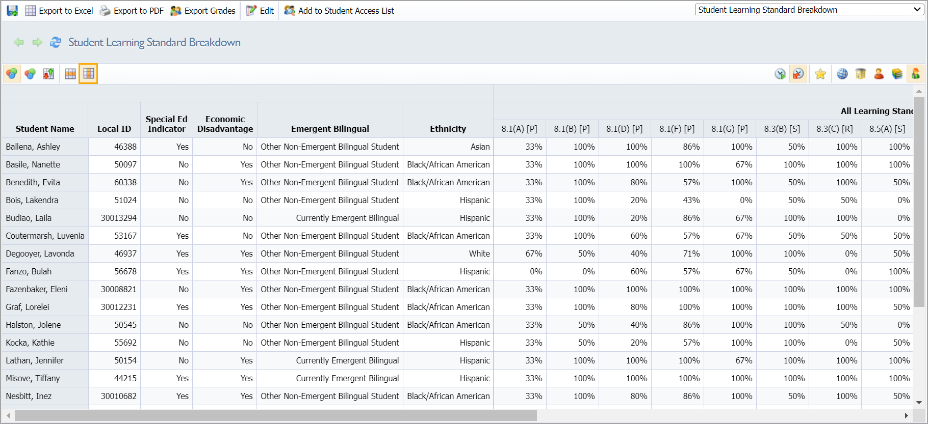
Vertical Orientation
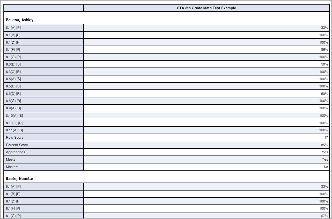
Here is the default data view for the Student Learning Standard Breakdown in the Compare Across Groups vertical orientation and matching PDF format.
Horizontal Orientation
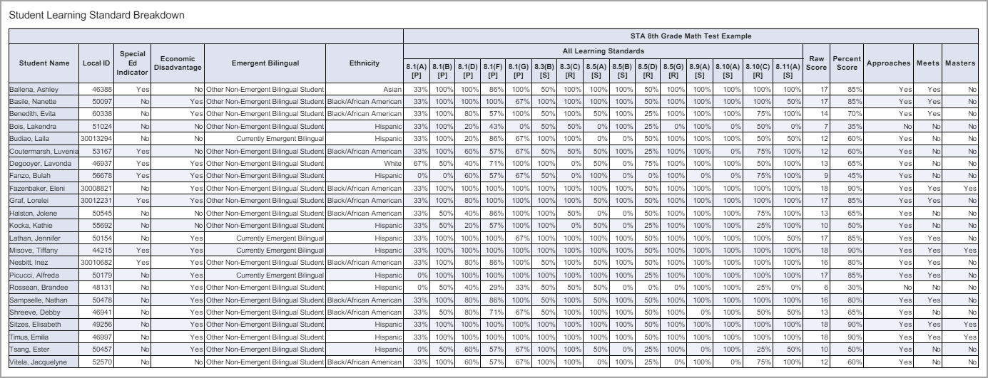
Here is the default data view for the Student Learning Standard Breakdown in the Compare Across Tests horizontal orientation and matching PDF format.
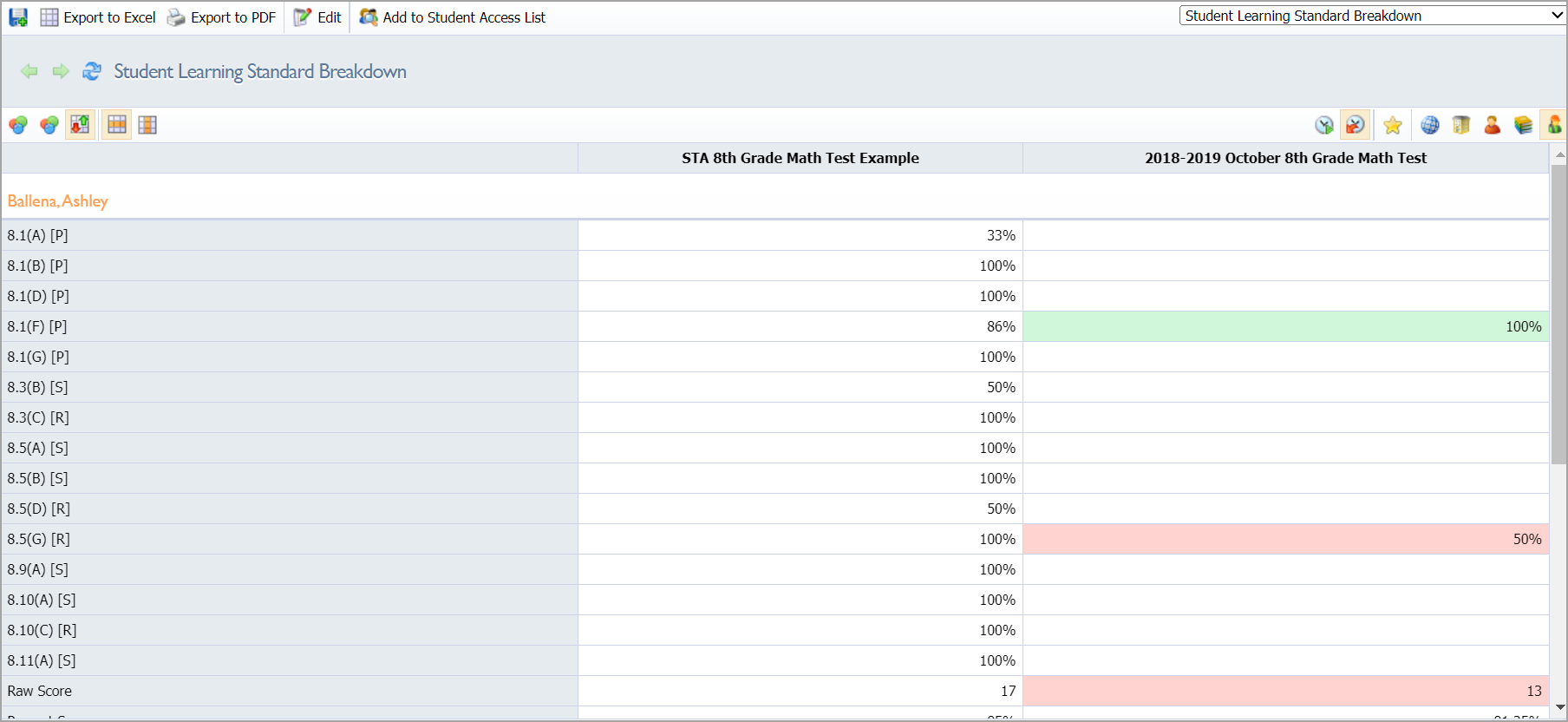
Comparison Across Tests
Users can view a color-coded, side-by-side comparison of multiple tests by selecting the Color by Comparison icon.
![]()
Green indicates an increase in student performance, while red indicates a decrease.